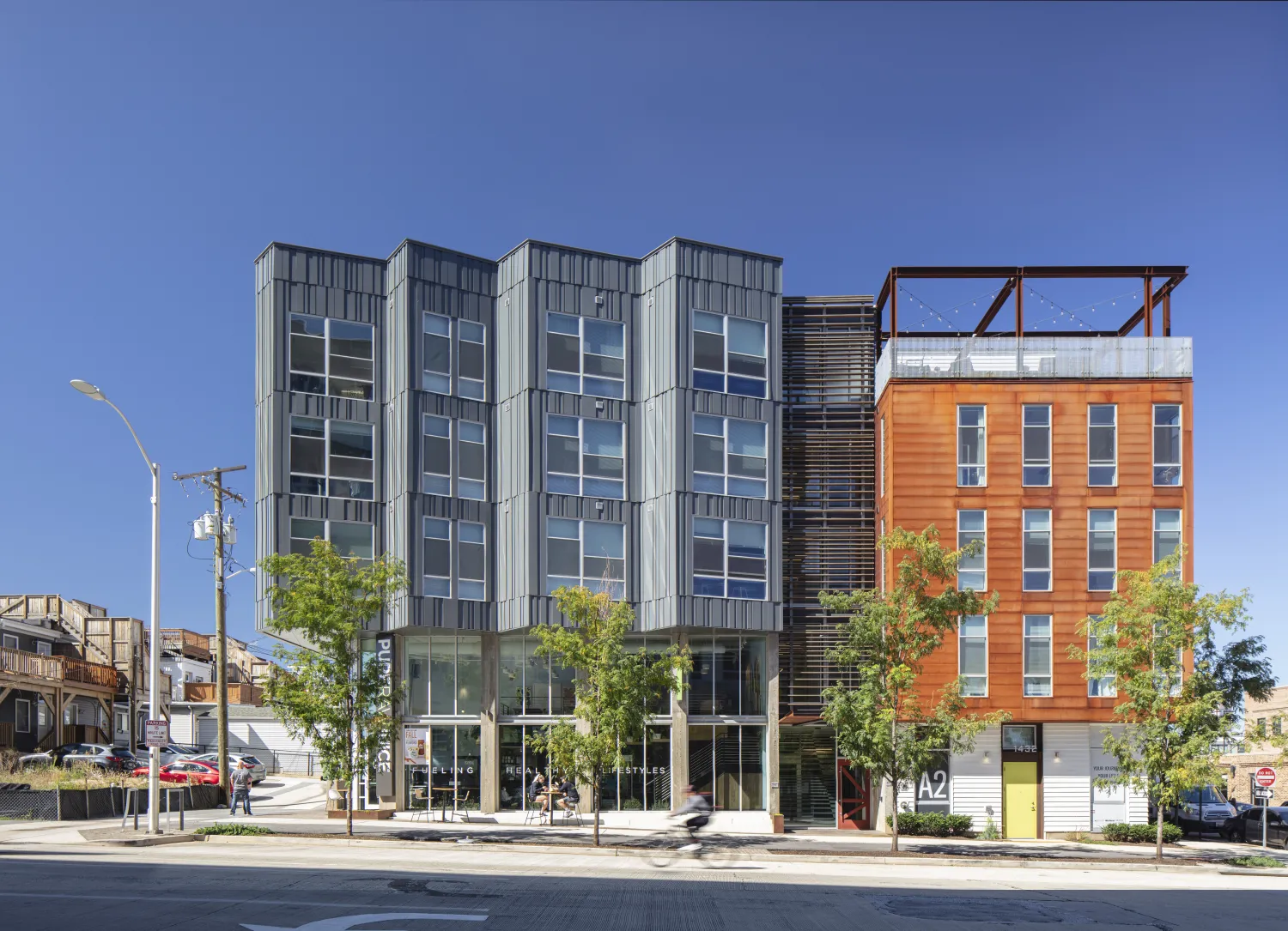
Lawrence Street elevation.
Part of working to create more and better housing for people is identifying gaps in the housing market. Government subsidies help incentivize the creation of affordable housing, and there is a seemingly-endless catalog of luxury housing. But this dichotomy often leaves a gap that makes finding appropriately-priced housing for middle class families and individuals a challenge. In simpler terms, there’s a growing workforce and a scarcity of housing.
Architects and private developers have an opportunity to design and build the “missing middle” housing stock—unsubsidized, market-rate housing with efficient plans and economical materials that come in at a lower price point. Or as we like to call it “affordable by design.”
A2, a five-story, 52-unit apartment building, capitalizes on efficiency and creative materials, as well as shared amenities, to fill in some “missing middle” housing in Baltimore’s Fort Point neighborhood. Completed in 2018 with Washington, D.C.-based firm Maurice Walters Architect, A2 is the little sister of Anthem House, a nine-story luxury building across the street, designed by KTGY Architects.
Both Anthem House and A2 were built by local developers War Horse Cities, Bozzuto, and Solstice Partners and work together to fill multiple housing needs. The 292-unit Anthem House caters to a higher price point and features ground-floor retail space, a fitness center, collaborative spaces, an Infinity pool, a dog run, and a large entertainment room. A2 has smaller units, with 36 490-square-foot studios and 15 835-square-foot two-bedroom units at the corners. Residents of A2 have access to all of the amenities in Anthem House, allowing the project to save money by not devoting space to its own amenities.
Massing and Material Efficiency
A2 is located on Lawrence Street between a large hospital and smaller vernacular row houses, so we broke the building’s mass into two volumes to help the building transition between its different-scaled neighbors. We clad each half in durable, inexpensive materials that still gave the design character.
A2’s northern half is wrapped in Corten steel and supports a breezy roof deck. We worked with the client and the local design review board to select Corten, an unusual material for residential construction in Maryland, as an alternative to Baltimore’s ubiquitous brick but still referential to the neighborhood’s industrial history.
A2’s southern volume juts out in sharp sawtooth bays that orient residents’ views toward the Patapsco River, which is just a few hundred feet away. This section is clad in Random Batten Siding (R.B.S.), our own take on fiber cement board mounted in a random pattern that gives the facade texture and variety. R.B.S. turns an inexpensive material into a high-design look with easy installation and a fraction of the cost.
The sawtooth bays float above a double-height retail space, fronted by long shallow steps that reference Baltimore stoops and offer casual seating space. Our clients helped bring a small local enterprise, Pure Raw Juice, to the building, adding foot traffic to the neighborhood retail space. In the summertime, the juice bar’s overhead door opens up, and patrons can sit on the stoops along the sidewalk
Local Influence
A2 takes its lead from the vernacular Baltimore row houses, which are typically narrow two- to three-story buildings complete with a sunny roof deck and parking in the alley. We equipped A2 with its own roof deck and barbecues for outdoor summer cookouts overlooking the Locust Point Waterfront. We spruced up the alley in back with a 10-foot-wide landscaped setback. We also created a nine-foot setback along Lawrence Street, allowing us to widen the sidewalk from three to eight feet, with the pedestrian path separated from a dedicated bike lane by a strip of plantings.
The design for A2 wouldn’t have been possible without our local architects, Maurice Walters Architect, who brought regional insight and helped make some of our more unconventional (by Baltimore standards) concepts a reality. With their local know-how and our outsider ideas, A2 brings a fresh perspective to Baltimore. And our extensive experience navigating San Francisco’s design review process helped move the project through the City’s challenging approvals system more swiftly than is customary.
The team also included local creative studio Younts Design who incorporated murals into the interiors, including the lobby, the main stairs, and the roof deck area. Their mega-graphics and signage bring vibrancy and identity to the building and round out our collaborative design.
A2 is a great model for “missing middle” housing that is affordable by design. It brings housing costs down as a satellite building that shares amenities with a larger complex. Its smaller, more efficient units are served by the same leasing, maintenance, and cleaning services as Anthem House. And it offers an expanded brand for the developer.
There will always be a place for subsidized affordable housing. But market-rate developers have plenty of opportunities—and good reasons—to diversify beyond luxury housing and create high-quality, lower-cost housing for the workforce, helping to fill in the missing middle and provide homes for all people.