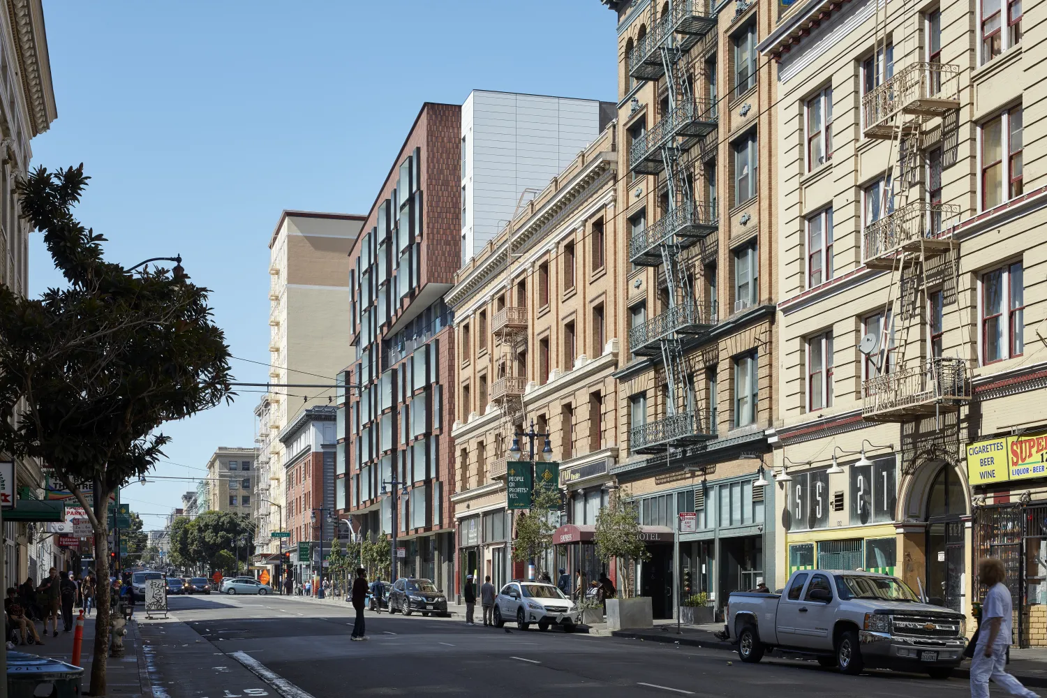
A creative response to the surrounding historic buildings allows 222 Taylor to fit into the neighborhood while maximizing the number of new homes provided.
San Francisco’s Tenderloin District is not a place visitors typically go to see architecture. While technically part of the downtown area—and just steps from some tony shopping districts—the neighborhood hasn’t seen the prosperity associated with the city’s decades-long tech boom. “It still feels pretty rough,” says David Baker, FAIA. But 222 Taylor, an eight-story, 126,000-square-foot affordable housing project designed by local firm David Baker Architects (DBA) might help change that feeling—especially for its residents, who include low-income and formerly homeless families and individuals.
The L-shaped structure holds the northeast corner of Taylor and Eddy Streets with 113 units that range in size from studios to three-bedrooms. The two wings with a double-loaded corridor define an interior courtyard at the northeast corner of the site. Ground-floor retail spaces with 15-foot ceiling heights house two long-established neighborhood businesses: a grocery store and a Yemeni restaurant.
The residential entrance is on Taylor, and from there, “it was important to have a direct view into the courtyard,” Baker says, “but you want a little more shelter from such a tough street.” Bike parking, a community room, laundry, and shared kitchen spaces are adjacent to the courtyard, which contains separate seating and play zones that provide varied social options for the building’s community. A management suite houses comprehensive support services for tenants, including two full-time social workers.
Designed to both fit in and stand out, the building’s masonry façade is composed of vertically oriented, thin clay brick. Masonry was important as a reference to earlier buildings in the neighborhood, but the architects thought of the multiple colors of 3/8-inch-thick face brick at 222 Taylor as being akin less to masonry construction, and more like the application of ceramic tile: “We were really using it like paint,” says DBA principal Daniel Simons, FAIA. This idea drove the deployment of the facing brick in vertical soldier courses. The ground floor is glass and concrete, so the material never actually touches the ground. The building’s massing is marked by asymmetrical notches at the sixth and seventh floors that align with historic neighboring cornices and provide dramatic articulation for the building’s two principal façades. “By cutting these slits, we created horizontal volumes that are proportionally similar to the horizontal volumes of the adjacent buildings,” Simons says.
The building is registered for both EnergyStar Multifamily High-Rise and LEED for Homes Mid-Rise. Achieving an EnergyStar rating (which was required for project financing) was a new wrinkle for DBA. It demanded commissioning, although the firm already advocates for this process as part of its sustainable strategy for other projects. “We spend a lot of time in San Francisco responding to air quality requirements that require filtered fresh air to all the units,” Baker says. “There’s a balancing act, because fresh air increases ventilation rates that can increase heating and cooling loads.” The architects adjusted window sizes and custom metal sunshade surrounds in response to their analysis.
The building is registered for both EnergyStar Multifamily High-Rise and LEED for Homes Mid-Rise. Achieving an EnergyStar rating (which was required for project financing) was a new wrinkle for DBA. It demanded commissioning, although the firm already advocates for this process as part of its sustainable strategy for other projects. “We spend a lot of time in San Francisco responding to air quality requirements that require filtered fresh air to all the units,” Baker says. “There’s a balancing act, because fresh air increases ventilation rates that can increase heating and cooling loads.” The architects adjusted window sizes and custom metal sunshade surrounds in response to their analysis.
The rooftop is a busy place, with solar domestic hot-water service, photovoltaic arrays providing electric power for the building, and an urban farm. The farm is a departure from similar ones the architects have designed in the past, where residents would grow vegetables for their own use. At 222 Taylor, “TNDC [Tenderloin Neighborhood Development Corporation, the client] partnered with an organization that manages that farm,” Simons says. “They’re growing a lot of food and it’s a wonderful initiative for the clients,” Baker says.
DBA’s 222 Taylor walks a fine line in the Tenderloin, inserting itself firmly but quietly within the area’s gritty context, raising design standards while still respecting the fabric that’s given the area its identity for decades.
View the full article: 222 Taylor in ARCHITECT Magazine.